How to use food safety data to improve your processes
Did you know that your food safety management system contains lots of data that you could use to drive quality and process improvements?
Once a process is in place, and you are using it on a daily basis, it often seems tiresome to step back and examine how the process is working. However, using the Safefood 360° Query Tool in conjunction with some simple Excel formulas and charts can easily tell a story about how the process is working. After some analysis, it can drive quality and safety improvements.
In this blog, I will walk you through one example:
- Where to find data that is suitable for driving quality and process improvement
- How to extract the data
- How to study and analyze the data
- How to use basic techniques, like standard deviations, to test your assumptions, validate specs and improve your system
You can start with monitoring data
The Monitoring module is an ideal place to pull data and begin your analysis. When you use this module for capturing production data, you will be able to find a wealth of information about your processes.
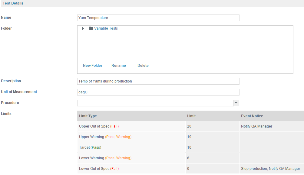
As an exercise, you can look at an example of monitoring Yam production. Specifically, you can look at one test that monitors the temperature of yams. Below is a test that has been set up with upper and lower limits for warning and fail results.
How to export your data using the Query Tool
I’l imagine this test has been used consistently in a monitoring program over the last year.
In the Query Tool, go to Add Query and open up the table MonitoringRecordSampleTestResult. Then pull in the TestValue and TestResult. Include also the Date of the entire record from the MonitoringRecord table.
Then in the Conditions, add a condition for TestName that starts with “Yam Temp” and any other conditions that may be relevant. For example, new fans or a new process may have been put in place in December of last year. In this case, only data after this change is important to your analysis; data before this date would not be reflective of your current process.
Now, you can execute the query and get a list of all temperature readings since December of last year, the results (pass, pass/warning, or fail) and the date of the test. It may seem simple, but there is a lot that you can do with this data.
Once you save the query, you can export it to Excel, and you can start looking at how your process is fairing. If you need more tips, we have also written blog posts that contain detailed instructions about how to use the Query Tool.
Add trendlines to your line charts
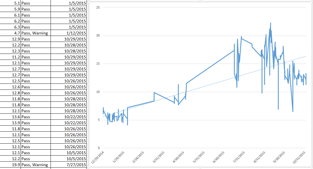
One easy way to examine this data is by creating a line chart of the temperatures over the dates of your results. Also, a trendline has been added by right-clicking on the line and selecting “Add Trendline”.
Several things jump out immediately; first, your yams are getting hotter, and second, the temperature variations are more erratic! What is happening? An obvious answer might be seasonal changes in the weather, but you see a spike in August/September that breaches our 20° C upper limit several times, and this might be peak production time. This chart has already given you two areas for improvement and root cause analysis.
Find out averages and standard deviations
Taking another approach, you can examine your temperature variations and averages using some formulas in Excel. By using the list of results and creating a pivot table, you can see some averages and use standard deviation to examine how erratic your temperature readings truly are.
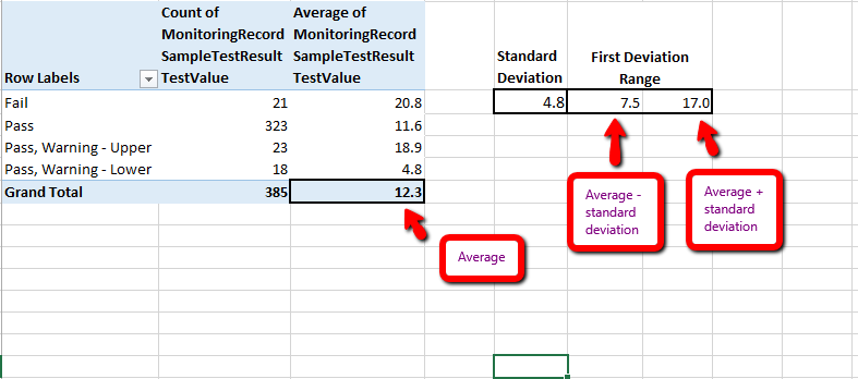
The average temperature across all results is 12.3° C. There have been 21 failures averaging 20.8°, 323 passes with an average of 11.6° and an upper and lower pass with a warning of 18.9° and 4.8° respectively.
Note that there are no lower failures, something to keep in mind when you examine your process improvements. Also, you have added a standard deviation using the =STDEV.P formula and discovered that +-4.8 °C will get you your first range of deviations. Standard Deviation follows the 68-95-99 rule; your first deviation means that you have 68% confidence our temperatures will fall between 7.5 (12.3 – 4.8) and 17.0 (12.3 + 4.8) degrees. (This will be different if you just examine those summer months mentioned earlier.)
Now you have some data to start examining the process and set new goals to further your quality and safety initiatives. If you look back at our test specifications you notice that the upper limit is 20° C. There may be nothing you want to do regarding this number as it is set as part of a safety standard or internal quality measure; there is no need to fail any product between your failure range.
Critically examine the limits of your tests
However, it would be possible to drive quality improvements by examining the upper and lower “pass, warning” limits. These are currently set at 19 and 6° C. But, your standard deviation gives you a narrower range of 17 to 7.5°.
Tightening up your range to match your deviations would give you an earlier warning when the numbers start fluctuating outside of the acceptable range and be a good quality goal for your company. Similarly, the average temperature of your yams is 12.3°, 2.3 degrees higher than the optimal temperature of 10° C.
Also, your entire temperature range is skewed higher than need be as you have never had a lower failure and a smaller number of lower warnings than upper. A further goal might be to lower your entire first deviation temperature range from 7.5-17° by 2° to 5.5-15°, especially during the hotter months. Overall, our entire process could be cooler by 2.3° C.
Use data, stop guessing
With these numbers, you have real data-driven process opportunities instead of guesses. You can do a similar analysis of a host of tests – microbiological, metal detection or any other test with a good base of results.
If, in addition to this data, you also had a good lean map of this process, it would be possible to overlay these results on your process and examine how your process is affecting the quality and safety measurements.
Lean, Six Sigma, or other process oriented methodologies along with data analysis similar to that above, can be powerful tools for meaningful process change.
Some commonly used techniques
- You can use the standard deviation to test the assumptions of your test specs
- If the standard deviation is very high, it could mean that your devices are poorly calibrated
- Instead of testing the absolute values, you could trend the categories “Pass, Warning, Fail”
- You could export datasets from two tests and correlate the results – this way you could test if product temperature is correlated with some other less obvious production values
We hope this quick blog will give you new ideas into how you can use your existing data to drive improvement in quality and food safety! Let us know your thoughts!


Leave a Reply
Want to join the discussion?Feel free to contribute!