Developing advanced food safety reports and dashboards using external BI software
You might not have realized it yet, but Safefood 360° has amazing reporting capabilities compared to most enterprise level software. This is because we give you super fast access to your data, allowing you to develop whatever reports you need. The system offers a number of different tools that allow you to get answers quickly and easily; the trick is just to use the right tool for the right question. And, sometimes you need to know how to use these tools together with some other reporting solutions. This is true for most enterprise software solutions like ERP or CRM systems.
There are two types of reporting tools available in Safefood 360°:
- Standard reports that are available in every module right out of the box. These reports can be printed, emailed or saved in various formats including PDF and Excel. Any of these reports can be automatically scheduled for repeating email delivery. The standard reports give you quick access to your data as registers and simple graphs. Most times, these reports contain exactly the answer you were looking for. So, they are great when you need quick access to some key information that you need for managing the day-to-day operations of your food factory.
- Query Tool that is found in the “Reports” module. It allows you to export whatever fields and columns you want and use the data in Excel or other BI (Business Intelligence) tools. Query Tool is your best friend when you want to develop advanced dashboards. When it comes to your monthly, quarterly and annual management reports, you will probably need to combine lots of different data sources into one chart or report. The Query Tool is the right way to go here.
In this blog post, I want to explore the possibilities of using the Query Tool together with Excel and other BI tools. I’m not going to explain in great detail how to build these dashboards, but rather to open your eyes to the possibilities. There are a number of tools out there that allow you to develop powerful reports and dashboards in a matter of minutes as long as you realize the potential.
What is the Query Tool?
Earlier this year, we introduced the new Query Tool into Safefood 360° and it has rapidly become one of the most used features in the software. It allows you to:
- Create your own reports by selecting whatever data you want
- You can order columns any way you want
- The data in columns can be ordered by date, by number, or by alphabetical order, etc.
- Data can be either printed on individual lines or summed together into aggregate values
- Queries can be saved for later access
- The data can be exported to Excel
It all begins by exporting your data
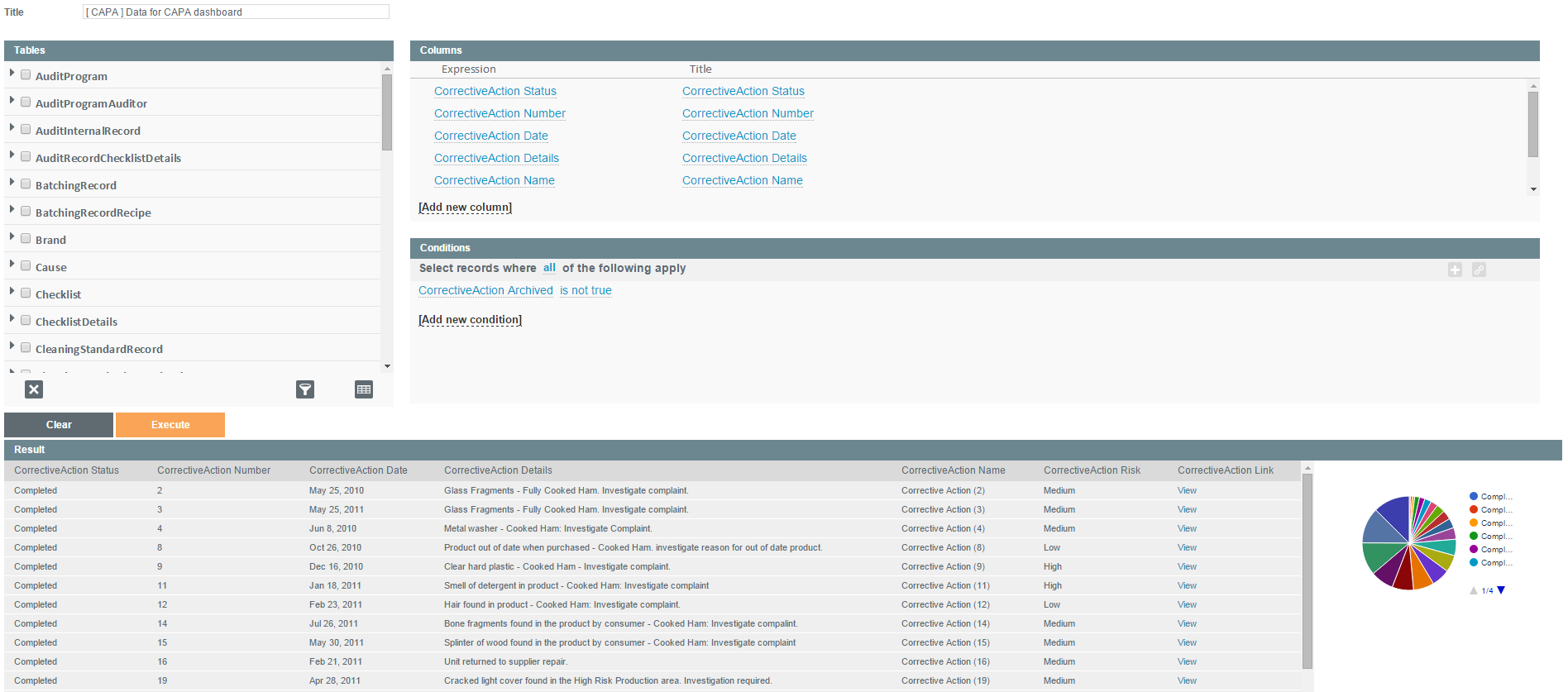
In order to use Excel or other BI tools, you need to first export your data. Query Tool is perfect for this and it only takes some seconds to grab your data for export. In the picture below, you can see the query I used to export data from the Corrective Action module with the intention of building some neat dashboards from the data. You need to save your query first, and when you open it, you will see an “Export to Excel” button.
A good rule of thumb for developing dashboards is to export all rows from the table and then filter the data in your BI solution. The more data you have in the beginning, the better the results will be.
Example 1: CAPA dashboard in Excel
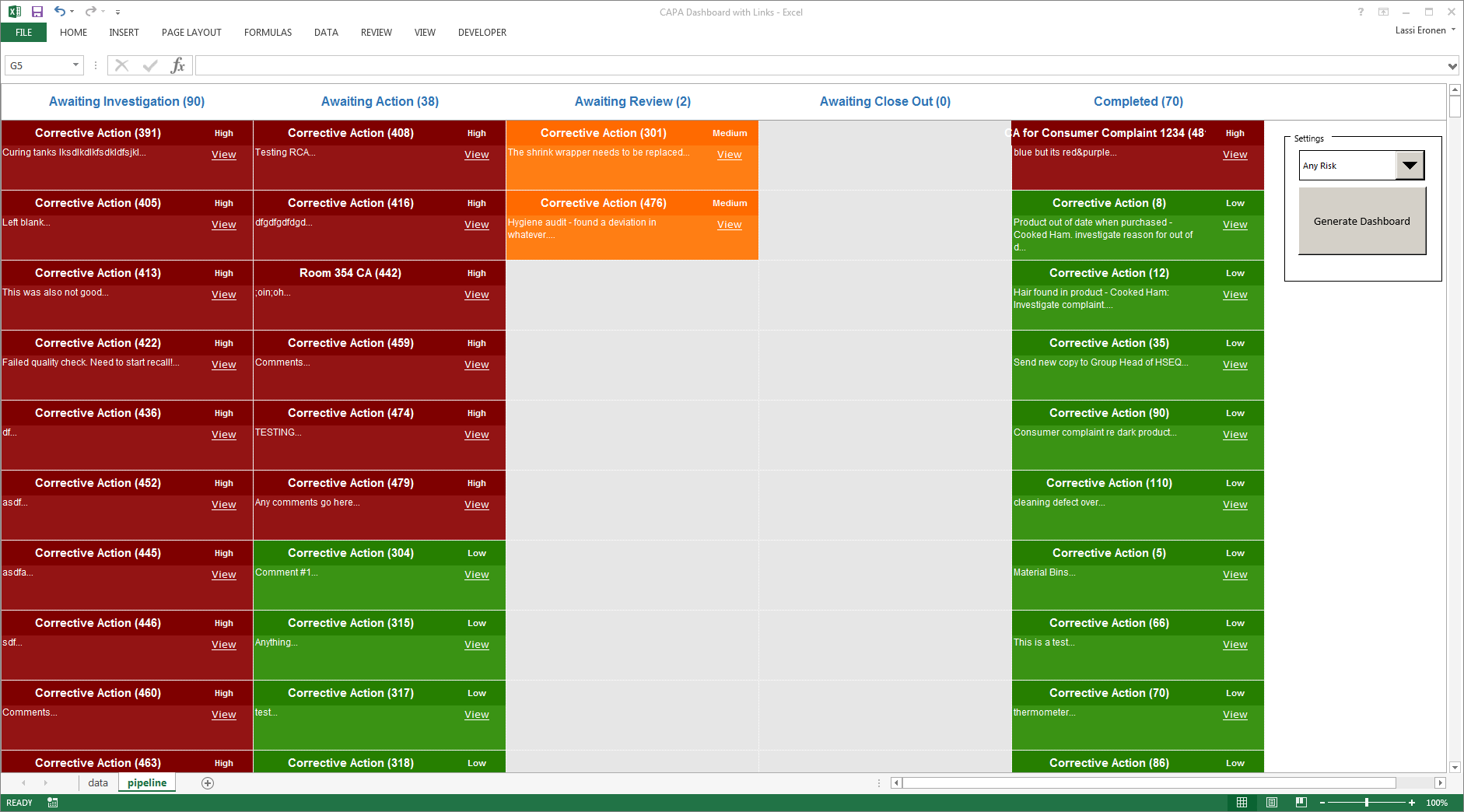
Here, we can see an automatically generated Excel dashboard where our Corrective Actions have been organized into a pipeline view. A simple macro runs through the exported data and drops the actions into this grid. Actions are colour coded, based on their risk category. You can filter the actions by the risk level and the link takes you to the original record. What a great way to see your corrective actions on one page! You could easily add a timeline slicer into your spreadsheet, allowing you to filter data by date as well.
Example 2: Monitoring deviations heat-map
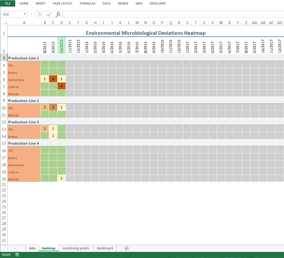
This chart is 100% formula based and it requires no Macros to be enabled. All you have to do is to copy and paste the data from a specific query into the spreadsheet. The query combines records from four different monitoring programs into one dataset and the spreadsheet then sorts and manipulates the data in a number of different ways. We also used conditional formatting to automatically generate highlights that draw the eye to values that are outside the average and only those months that have past.
Example 3: Advanced dashboards using Zoho Reports
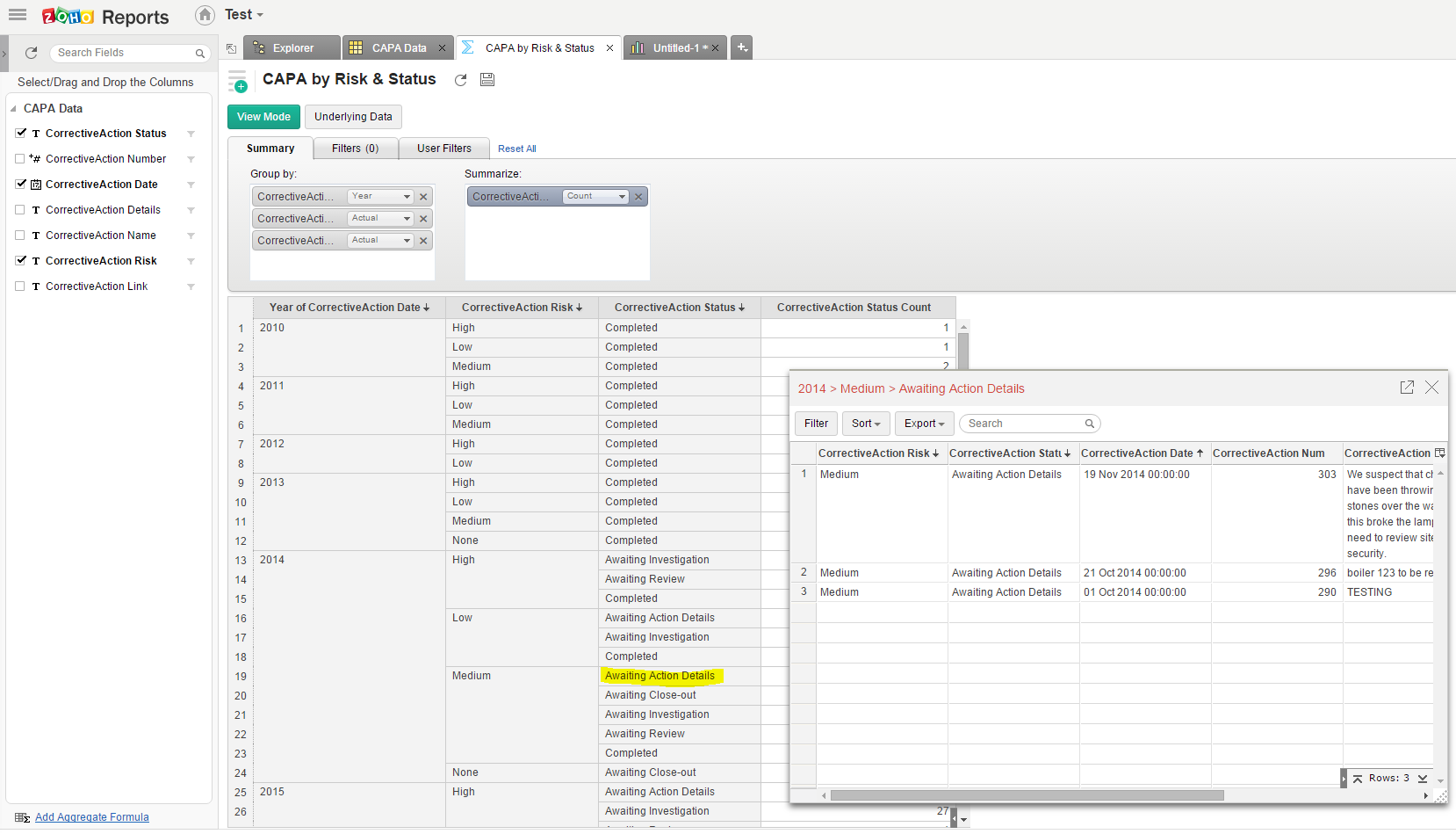
You could use any BI software, but if you are new to the field, Zoho Reports is an inexpensive and easy to use business intelligence suite that can solve 95% of even your most complex analytical tasks with little learning curve. It has similar, if not more comprehensive, features than other BI software packages, but in many ways it’s much easier to use than other software suites, like Qlick where significant time can go into developing dashboards. Zoho Reports works in the cloud – so you don’t have to install anything locally and you can access your dashboards from anywhere – and there is a free version available.
The picture above shows a report where we grouped the data using three variables: Year, Risk, & Status. Clicking on any of these labels reveals the underlying data, which means you can drill down very easily without any programming. Below, you can see the same report embedded into a single dashboard with two other widgets and the ability to filter the data based on risk, date and status. Building this dashboard took less than 10 minutes from start to finish, which is testament to how easy it is to get dashboards these days – all you need is the source data and a good idea. The Query Tool gives you access to the data faster than almost anything else I’ve seen, so getting the inspiration is the only thing you have to solve yourself.
Example 4: Advanced dashboards with Microsoft Power BI
Microsoft has a handy software called Power BI and there is even a free version of it. The software works in cloud, desktop and mobile environments, which is great for having your reports and dashboards available in every channel and device you might be using.
Setting this dashboard up using the same dataset took about 15 minutes. Power BI is nowhere near as flexible as Zoho Reports is in terms of your ability to manipulate the data by calculating fields, creating custom formulas from your dataset, etc., but it does offer a really sleek user experience with visually appealing results. Drilling down to segments of the data is also extremely easy; all you have to click is one of the widgets and the dashboards adjust showing just the underlying data. Having the free version available can make the threshold of getting started very low.
Example 5: A simple supplier dashboard using Qlik
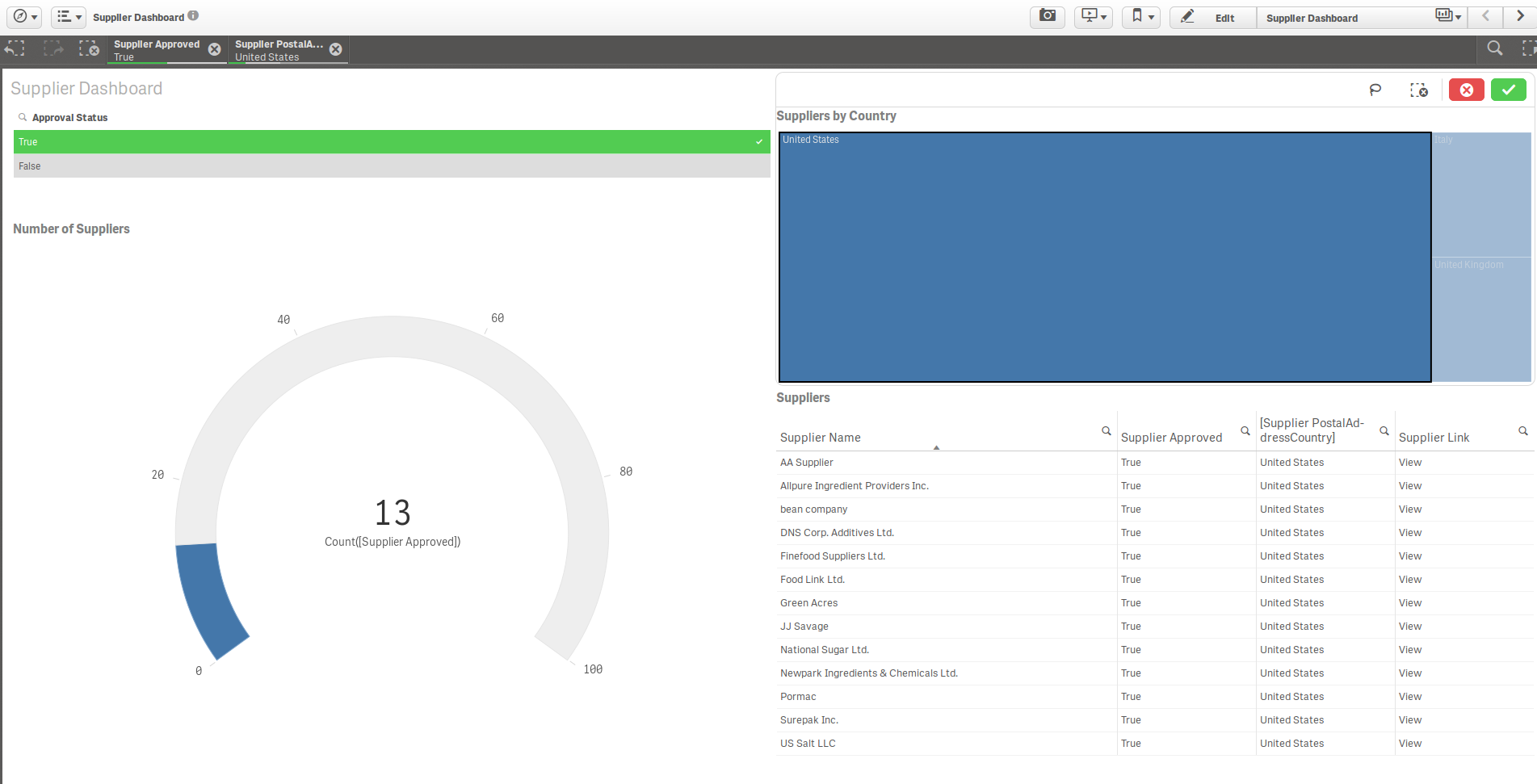
As I mentioned earlier, Qlik is a software that can take some time to set up. However, when you get the hang of it, it is probably the best solution of all the listed software solutions: It is cloud based, offers sleek style and powerful formulas for manipulating your data. With Qlick, it is easy to combine data from a number of datasets into the same dashboard, which is great when you want to get information from more than just one module. Free versions are available for both cloud and desktop. This example shows you a simple supplier dashboard where we have drilled down to the data, based on approval status and country.
When it comes to BI suites the sky is the limit to what you can build. I hope this post comes in handy for those power users of Safefood 360° who are looking for some inspiration on what they can do with all their data. Have you tried building something more advanced in Excel or some other BI suite using your Safefood 360° data?





I a Quality and Food safety manager in meat factory
I need to know please the cost of this system and how can I apply it in my industry scope